 How to resolve AdBlock issue?
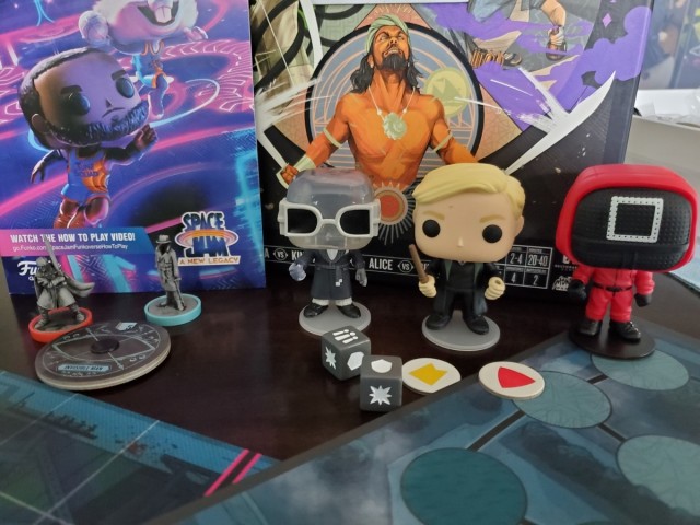
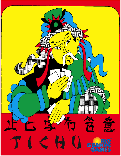


Have you been following the ongoing drama of Glory to Rome? The original game by Carl Chudyk has been a gamer favorite for several years, but it’s impossible to have any conversation about the game that doesn’t eventually come back to the artwork. Cartoony, garish, and loaded with gradients, Glory to Rome wasn’t exactly easy on the eyes. Cambridge Games sensed an opportunity to Kickstart a do-over of the artwork. The ensuing fracas over the protracted production cycle of this reprint could fill its own article. But it’s hard to argue with the new look of the game, now rendered in stylish black and white with appropriate splashes of color. It makes the game look far more professional and attractive. There’s just one problem: I kind of miss the old artwork.
Don’t get me wrong, I never liked the original artwork. It’s too homely to love without at least a little irony. But the thing is, it got to such a point that I would get annoyed when people harped on it. In my head, the bad artwork was a given, a part of Glory to Rome as much as the dynamic cardplay and deep strategy. As trademarks go terrible artwork is not one to strive for, yet in a perverse way it was a part of the whole. To have a version of Glory to Rome without poorly-rendered amphitheaters feels just a little…dishonest. There are those who would say it doesn’t matter at all, and objectively they’re right. But there is a profound emotional connection between components and our emotional response to a game.
This isn’t exactly a new concern. One of the basic tenets of the Ameritrash movement was that components matter. Not everything can be expressed by a little wooden cube, and not every color scheme needs to be multiple shades of tan. Indeed, a lot of new Euros have embraced this as well. Games like Cyclades and Defenders of the Realm took production to a ridiculous level despite their rather Euro-ish roots. So clearly there’s no question that a good production makes a game more appealing. But I find it fascinating that such graphical and component upgrades are not always considered an improvement.
This conversation is especially relevant these days, because as I’ve stated before we are in the age of reprints. Games that have been long out-of-print are returning to shelves, all the time with new art and pieces. And in almost every case, these graphical choices are picked over endlessly by fans of the original game. Obviously there are times when a new coat of paint can severely drag down a game. One key problem (among many) with Fantasy Flight’s attempt at recasting Dune as Rex was a board that was not nearly as simple to use as the much cleaner one from Eon’s original. Usability is often sacrificed at the idol of “looks cool,” and FFG has been as guilty of this as anyone.
But more curious to me is when something seems like an obvious upgrade and isn’t immediately embraced by fans. FFG’s reprint of Wiz-War feels like the poster child for this phenomenon. The original Tom Jolly game is well-known for its cheap look. The fun illustrations on the cover helped a bit, but mostly the game just consisted of a few tokens and a lot of business cards. So it seemed like a good opportunity for FFG to really dress the game to the nines. Plastic minis for the players instead of chits! Illustrations on every card! Full color graphics! All this was done, for the most part, with good taste. The card illustrations are especially fun. But the response on the Geek has bounced between mild amusement and outright antipathy. I’ve read numerous comments complaining about all of these things, from the minis to the illustrations to the mere suggestion that the game is in a big box. Keep in mind this is not a huge $80 production. It’s $50 at retail, probably as reasonable as big-box hobby games get these days.
The answer is that for all of the old guard, those changes weren’t merely cosmetic. They changed something about the personality of the game. Was it reasonable to assume that a modern publisher would release a version of Wiz-War that looked like the old version? Almost certainly not, but that doesn’t make any difference. And now that I think about it, it’s not an unreasonable response. If we’re going to accept that production of a game matters, it stands to reason that any change in that production alters the experience a bit.
It’s easy to go overboard with this response, especially when the production is ALL that’s changed in a game. That’s true in a case like Glory to Rome, where the new artwork is pretty much the only alteration. A game is more than the sum of its rules, but there’s zero functional change with new illustrations and plastic dudes. I also worry that responses like the one that greeted Wiz-War alienate new fans. When the old fans gripe endlessly about silly things I do wonder if it has an adverse affect on the success of the new version. It’s my understanding that Wiz-War hasn’t been a very successful reprint, which is a shame because it’s a great game. And let’s face it, new fans of a game don’t like hearing about how they have the crappy version of a game they love.
But there is truth to the idea that games are a whole, just as you get them. If that weren’t true, no one would have a problem with using print-and-play for every game. The art, the pieces, the rules, the players, even the environment where you play, all of these combine into making the experience that we call a game. One little thing can shift it, sometimes negatively. And there’s something to be said for a game that gets the upgrade right, like Cosmic Encounter and Talisman. Most fans embraced the new productions for those games, and maybe that’s because they’re still on the same scope of the original. Talisman always looked big and epic. Maybe those who complain about their simple little games getting a graphical face-lift are really mourning the fact that there is increasingly little room for the little game that could. Nothing stays simple in this hobby for long anymore. And besides, we all know there’s a certain satisfaction in just being an old crank who likes to complain.